Brand stories differ immensely, they are all unique and can take you on an interesting journey through how a business was built, evolved, has grown, or changed over a period of time. What’s most interesting is how brands that are over 150 years old like Cadbury or Levi’s have adapted over the years and managed to keep a strong identity as the world changed around them.
The evolution of a brand can be subtle or a complete overhaul. You may not notice it but companies large and small make tweaks to their logo or supporting brand assets all the time. Sometimes they are minuscule and other times they are a completely new and fresh look. Either way, taking a look at the progression is something that is very intriguing. Which is why I’m excited to share the evolution of the Hitch brand with you.
Change is scary but good.
After six years together, my business partner Renee Bauman and I made the very tough decision to simplify our lives a bit and divide our business. Renee set out to focus on what she was most passionate about, Weddings, and I was ready to focus 100% on building brands and websites for small businesses, non-profits, and entrepreneurs. It made perfect sense, but when your business partnership is much like a marriage (lol), it can make your decision an emotional one. In the end, we realized we were staying business partners because we were such close friends, not because it made business sense. When we took a step back and analyzed the situation, we realized we were each other’s safety net, good or bad. The thing is, you don’t need to be business partners in order to support each other that way, what a dose of reality for us.
When we took a step back and analyzed the situation, we realized we were each other’s safety net, good or bad.
So we made the decision to part ways, Renee moved her office (really far away to the office next door), I rebranded my division of the business to UpFrame Creative and started the process of setting up a legal business all over again from scratch. Thank goodness Renee was just next door and was keeping the Hitch name alive, something that was a big part of who we both are as entrepreneurs.
Looking back it was the right decision as both our businesses are thriving and so are we. I can honestly say when we decided to build a business together, I did not imagine that we would end up with two separately functioning successful businesses in the end. I truly thought our business would evolve to focus on one thriving division, but that was not the case. We were together, but, we were driving in different directions.
Over the years the Hitch brand evolved quite a bit with slight color and naming tweaks, with its biggest change most recently, a beautiful rebrand. A new logo that was 100% developed for Renee and not the combination of both of us.
What is a rebrand vs brand evolution?
A rebrand is a significant shift in how your brand looks, acts, and presents itself. (If there was ever a reason to significantly change how the Hitch brand acted, it was now.) A brand’s evolution is more of a small step to make changes, updates, follow trends, or a slight tweak in style. Over the years the hitch brand has done both. What a beautiful visual story of growth.
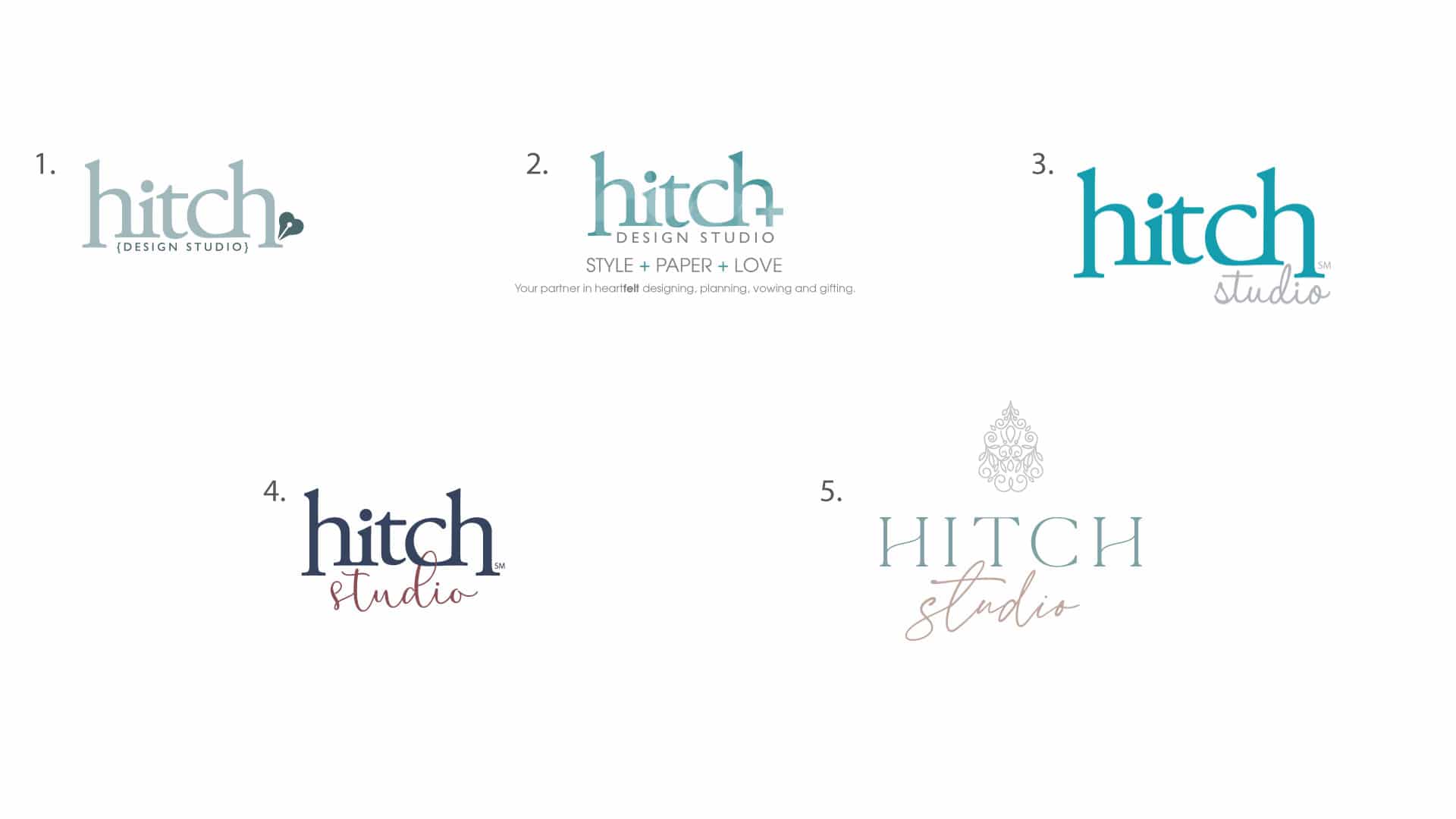
Let’s take a look at the evolution of where we started, to the new rebrand today!

- Our first logo. I remember working so hard on this. Fussing over the colors, how to create a sense of connection with the typeface, and creating a supporting icon was a MUST. I remember laboring over what that should be, combining weddings and design into one, hence the heart and fountain pen (if you were not sure what that crazy icon is). The strongest part is the manipulation of the lowercase h’s. They combine with the letters next to them and also create a frame for the DESIGN STUDIO text below it by extending down.
- The PLUS sign. From there I tried to tweak the brand by utilizing a + sign. We were struggling to find our identity because we did so much. How do we effectively communicate all these wonderful things we do with ONE logo. So we came up with a tagline that was STYLE + PAPER + LOVE and the plus sign became our new icon. Although it was fun, this logo was short-lived. Our serif h’s are what stood out the most and were something we eventually wanted to keep. This logo just complicated things, which was the opposite of what we were trying to accomplish.
- This logo was developed for our new location. The perfect reason to evolve our brand. We brightened up the colors, simplified the name and added a little fun with a script, but still keeping our strong serif hitch.
- This was the beginning of a new evolution for Renee! She updated the colors so they felt more native to the brand she was trying to convey, she chose a script that spoke more to her clientele (brides) and it was a great update, but she needed more. Something that felt more like her.
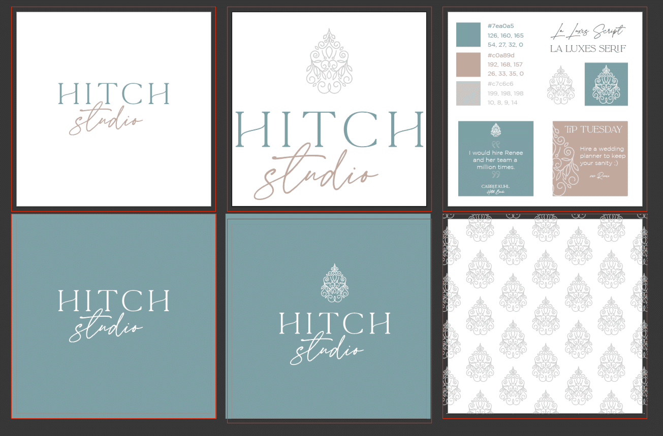
- Enter a rebrand. I was beyond excited that she wanted me to help with her new brand. Hitch is such a labor of love for me and to give it new life was so special to me. My task was not easy, I really needed to shift my mindset and remember that I was not creating another brand tweak to “our logo” but was creating something completely new for my sweet friend Renee. Something that felt like her style, that spoke to her clients, and that she loved.

The new look.
The criteria:
- “Something that includes the combination of text, a script, and an icon.”
- “I love a pear-shaped diamond because it’s description is so ME”
- “The elongated pear shape shows a woman to be an individual, yet she still has a soft side for traditional romance. She may be a trendsetter with this unusual shape. The woman who chooses this shape tends to set a high standard for herself and everyone around her. It can be difficult living up to her expectations. (That is SO ME! Haha!)
- The pear shape of the diamond is a testament to a woman who is bold and walks to the beat of her own drum. This style is perfect for an empowered woman with a flair for romance and elegance. (This is also ME!)”
- And lots of conversations. 😉
Time to get to work, we went through a lot of iterations, but I was much more collaborative with Renee than most, because… well, it’s Renee. We know how one another thinks. She would point out aspects of my sketches or digital designs that spoke to her and soon this logo evolved out of some random flourishes I pulled together into a pear shape. It spoke to us. We loved it… but “one more tweak. Flip it around”, said Renee. So I grabbed my mouse and flipped the icon around. I said, “OH! It looks like a fancy chandelier”… “DONE” said, Renee. “It’s perfect”.
Like always, she was right, this was very Renee. Elegant, sophisticated, sweet, very organized with just the right amount of fun. 😉
Thank you my dear friend for the years together and the future apart.
